← Ideation and Prototyping / Playful Interface

Playful
Interface.

In this assignment, we explore how to transform a digital interface into a playful physical experience. By using tangible materials and interactions, we rethink how people engage with technology and what new experiences become possible beyond a screen.

Course
Ideation & Prototyping
Assignment
Playful Interfaces: A Translation of a Digital to Tangible Interface
Interface
Google Calendar
Format
Process Documentation

01. Choose & Analyze

I chose Google Calendar because I use it pretty regularly to organize fixed events like classes, meetings, and appointments. I like how visually clear it is and how easily I can see which time slots are occupied.

However, I rarely put homework, studying, or personal projects into my calendar because it’s difficult to predict how long they’ll take. Sometimes my calendar looks relatively empty, even though I still have a lot of work to do.

This made me realize that Google Calendar is good at showing how our time is scheduled, but not necessarily how busy we actually are.

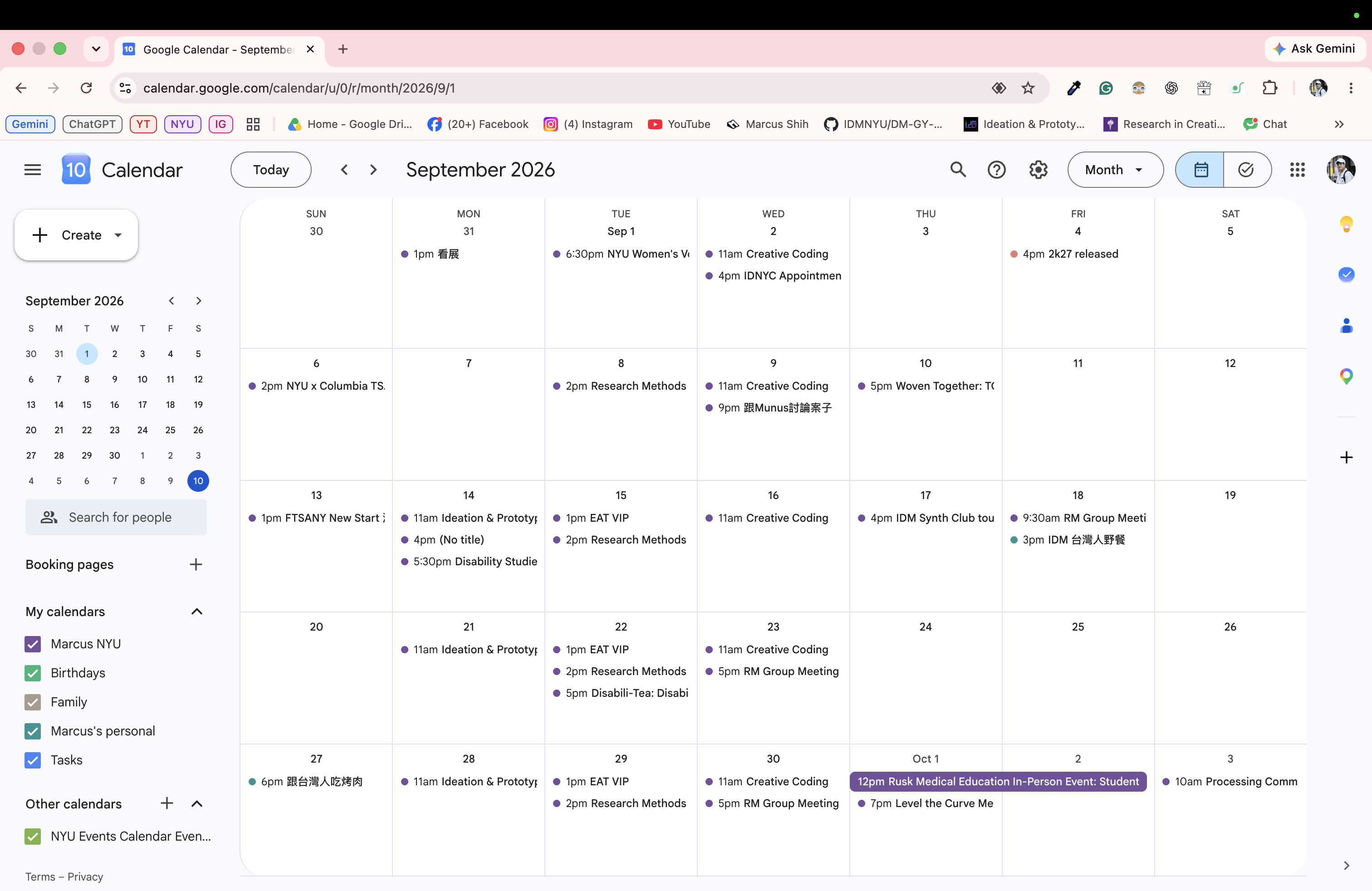
Google Calendar's September 2026 month view with color-coded classes, meetings, appointments, and open dates.
My Google Calendar in September 2026.

It's Complicated:
Dear Google Calendar

I really like how you help me organize my schedule. I can easily see when I have classes, meetings, or other events.

But the thing is, I don’t put everything into my calendar. Homework and personal projects are harder to schedule because I don’t always know how long they’ll take. So sometimes my calendar looks empty, even though I actually have a lot to do.

I think what bothers me is that you only show how much time I have, but not how much energy I have left. Just because I have a few hours available doesn’t necessarily mean I can take on more work.

I wish you could help me think about how much effort each task requires, rather than just how much time it occupies.

Three Tensions

Scheduled vs. Unscheduled Work
Not everything that requires effort appears on my calendar.
Available Time vs. Available Energy
Having an empty time slot doesn’t mean I have enough energy.
Fixed vs. Unpredictable Duration
Some activities are difficult to schedule because I can’t predict how long they’ll take.

02. Identify an Opportunity

I remember one day when I had a group meeting at 10 AM, followed by commuting, preparing materials for a meeting with my professor at 1 PM, and class from 2 to 5 PM. Right after class, I rushed to Manhattan for a friend’s birthday party at 6 PM and didn’t get home until around 10 PM.

When I was planning everything, I thought it was totally fine. As long as there was an empty time slot, I felt like I could add another event. But by the time I got home, I was completely exhausted.

This made me wonder: just because something fits into my schedule, does that mean I actually have enough energy for it?

One day, on my calendar

  1. 10:00–11:00 AM Group Meeting
  2. 11:00 AM–12:00 PM Commute
  3. 12:00–1:00 PM Printing and Preparation
  4. 1:00–2:00 PM Meeting with Professor
  5. 2:00–5:00 PM Class
  6. 5:00–6:00 PM Commute to Manhattan
  7. 6:00 PM onward Friend’s Birthday
  8. Around 10:00 PM Home

03. Generate Three Interaction Concepts

I explored three different ways to turn some of Google Calendar's limitations into physical interactions. Each concept focuses on something that isn't always obvious when we're planning our schedules.

01. Time Spillover

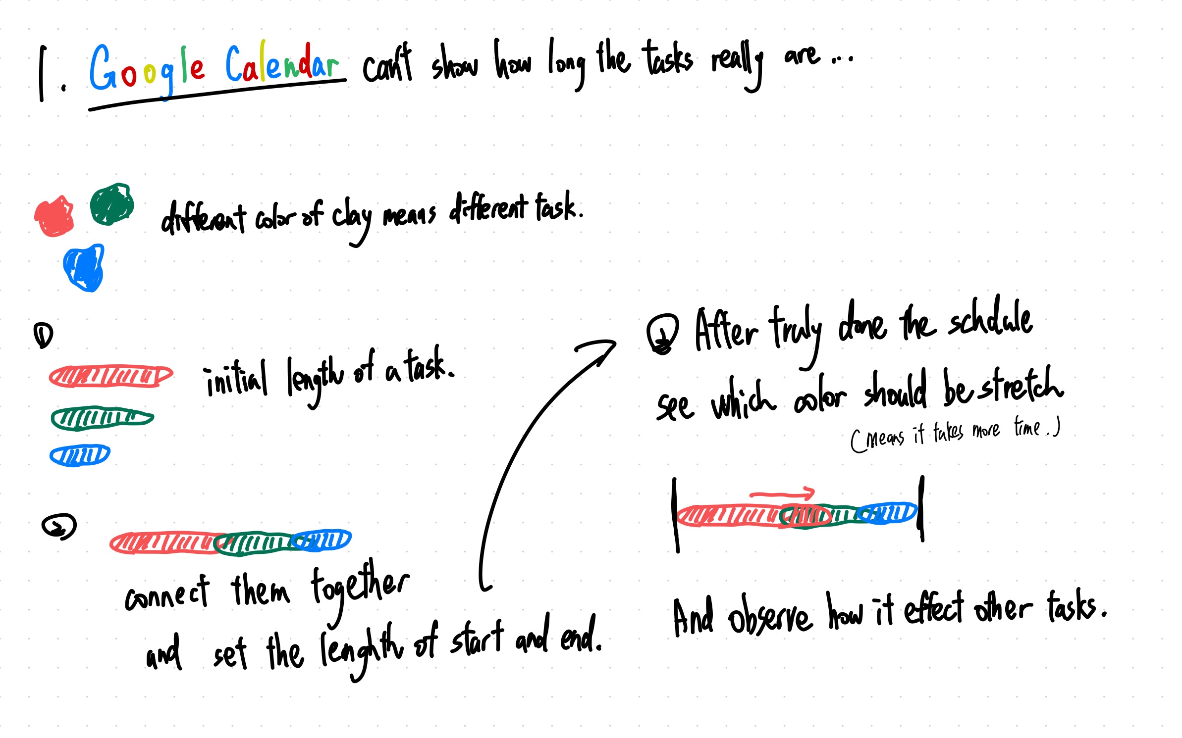
Hand-drawn Time Spillover concept showing red, green, and blue clay task lengths joined into a timeline, then stretched to reveal the effect on later tasks.
Initial sketch exploring how stretching a task changes the rest of a schedule.

Google Calendar lets us assign a specific duration to each event, but tasks don't always take as long as we expect. My idea was to use different colored, stretchable paper strips to represent activities. Users would first arrange them along a timeline based on their estimated durations. After seeing how long each task actually takes, they could stretch the strips and observe how one delayed activity affects everything scheduled after it.

02. The Weight of a Day (Selected Concept)

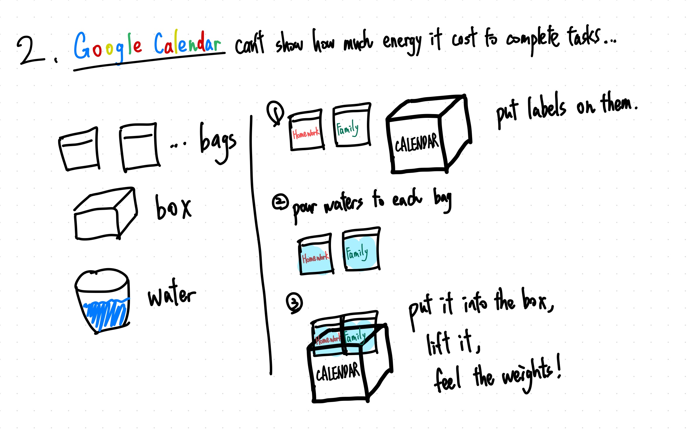
Hand-drawn concept showing bags labeled Homework and Family filled with water, placed in a CALENDAR box, and lifted to feel their combined weight.
Selected concept: allocating water to tasks and lifting their accumulated weight.

This idea focused on something less visible: how much energy different activities require. I imagined using labeled bags to represent tasks, with users pouring different amounts of water into each one based on their perceived workload. They would then arrange the bags inside a container labeled "CALENDAR" and lift it to feel the accumulated weight. I chose to develop this concept further because I was interested in how physically experiencing weight could make people reflect on the difference between having enough time and having enough energy.

03. The Missing Time

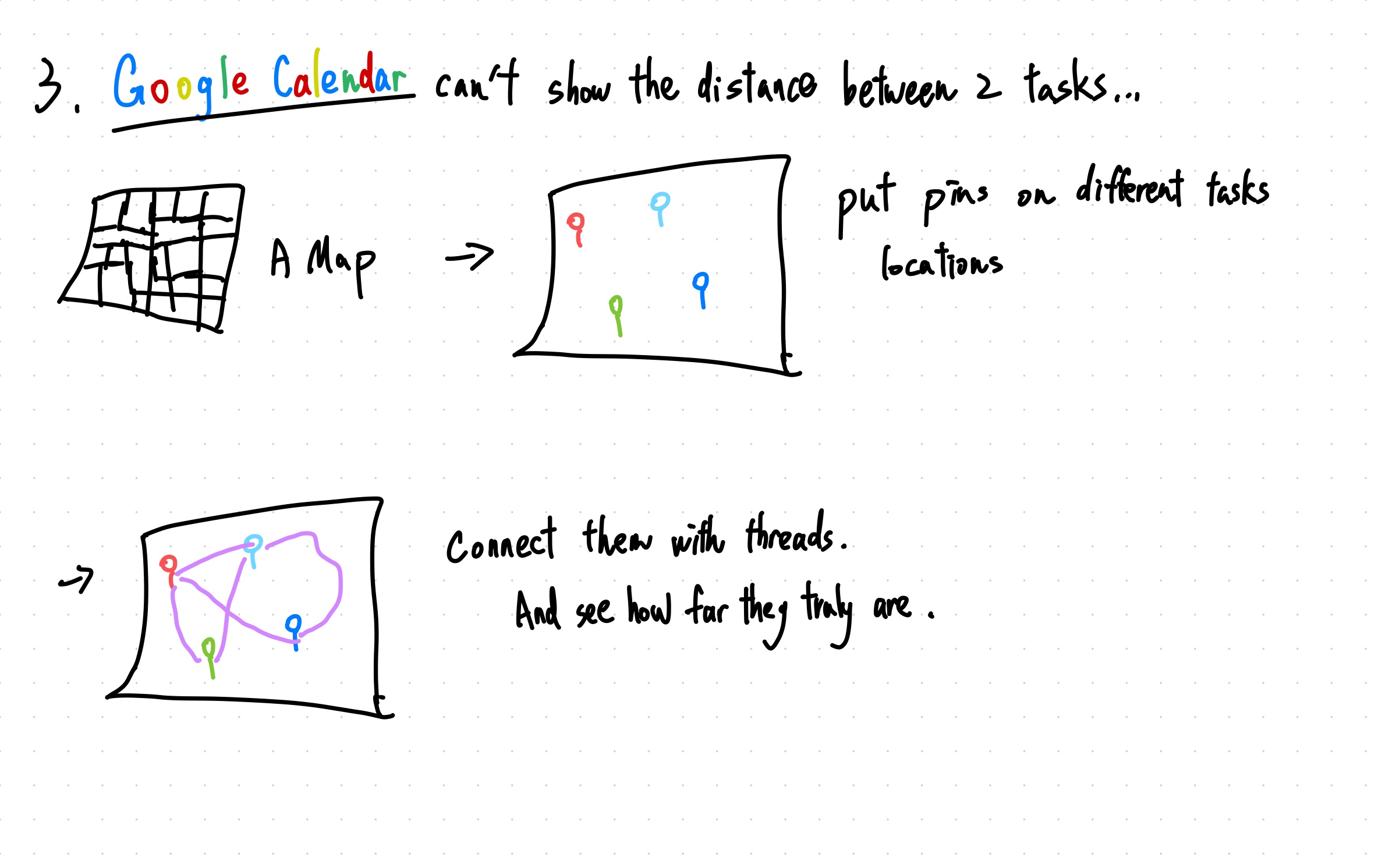
Hand-drawn Missing Time concept showing colored pins marking task locations on a map and purple threads connecting the locations to reveal travel distances.
Mapping event locations and connecting them to make commuting distance visible.

Another limitation I wanted to explore was how Google Calendar doesn't always make us notice the distance between activities. For this concept, users would place pins on a physical map to represent different event locations, then connect them with threads in the order of their schedule. The resulting paths would help visualize how far apart the activities are and remind users to consider commuting time when planning their day.

04–05. Prototype, Test & Document

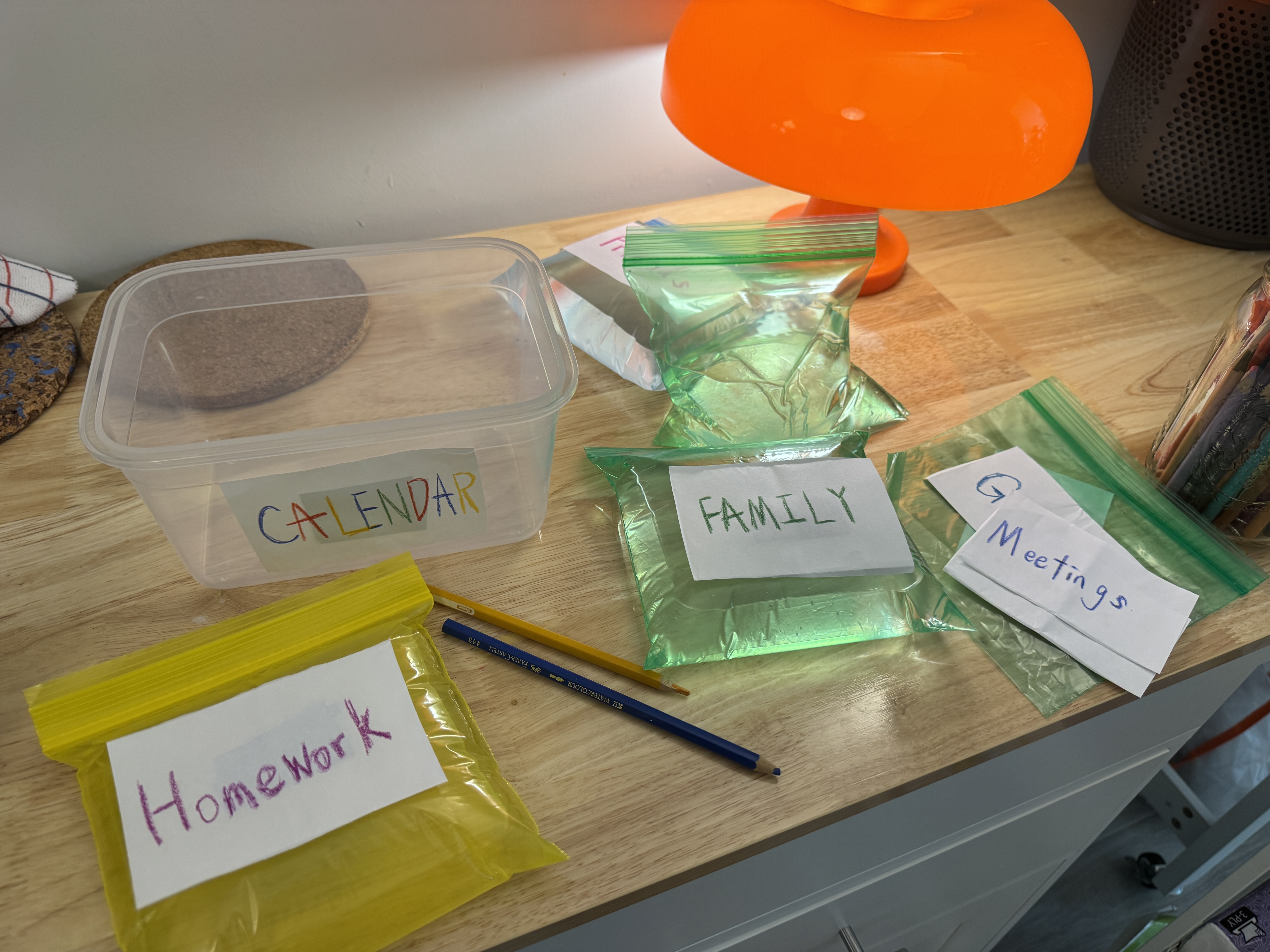
A transparent CALENDAR container beside colorful water-filled activity bags labeled Homework, Family, and Meetings on a wooden table.
The Calendar Box and activity bags prepared for the tangible scheduling experience.

Material Exploration

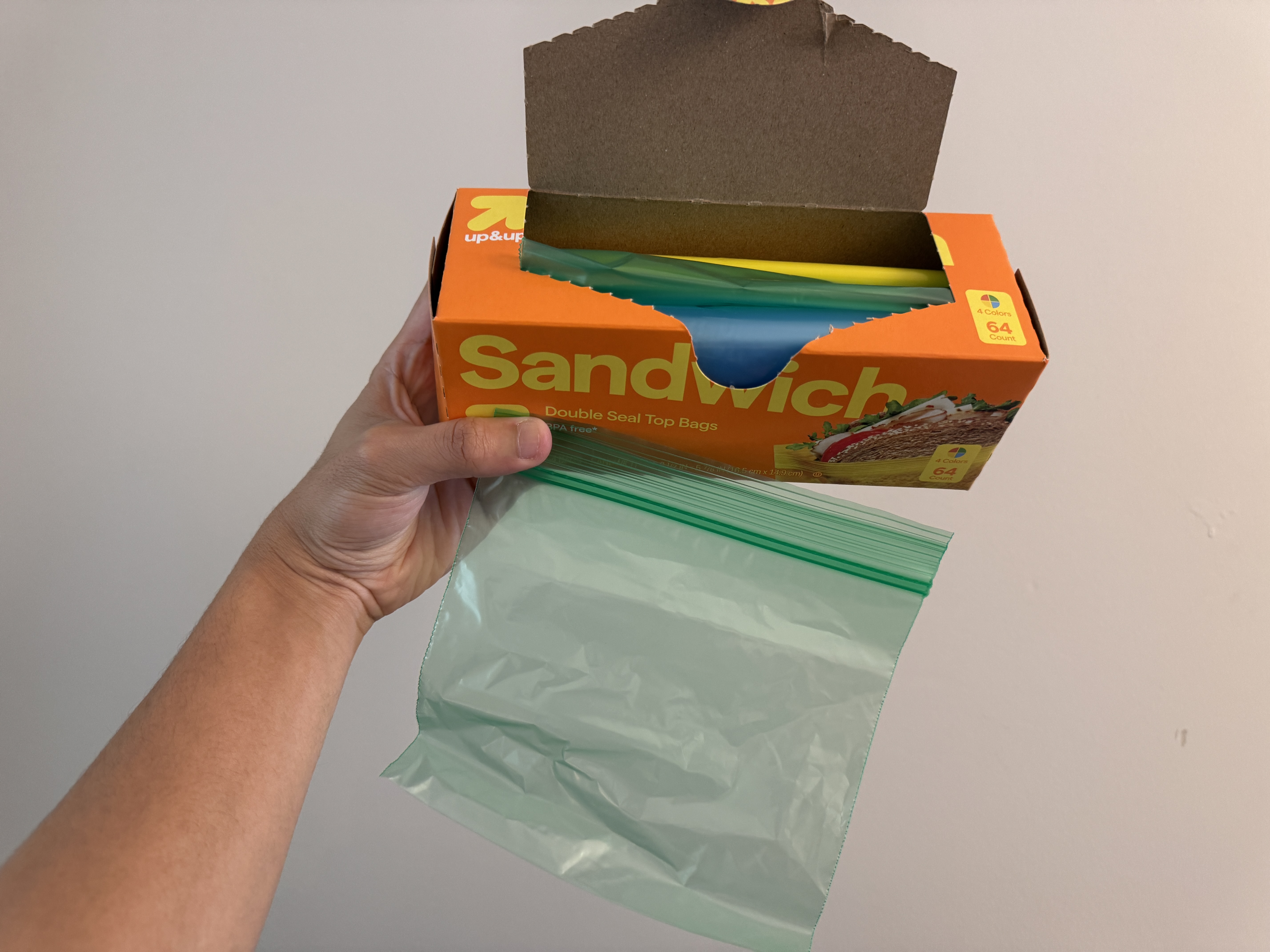
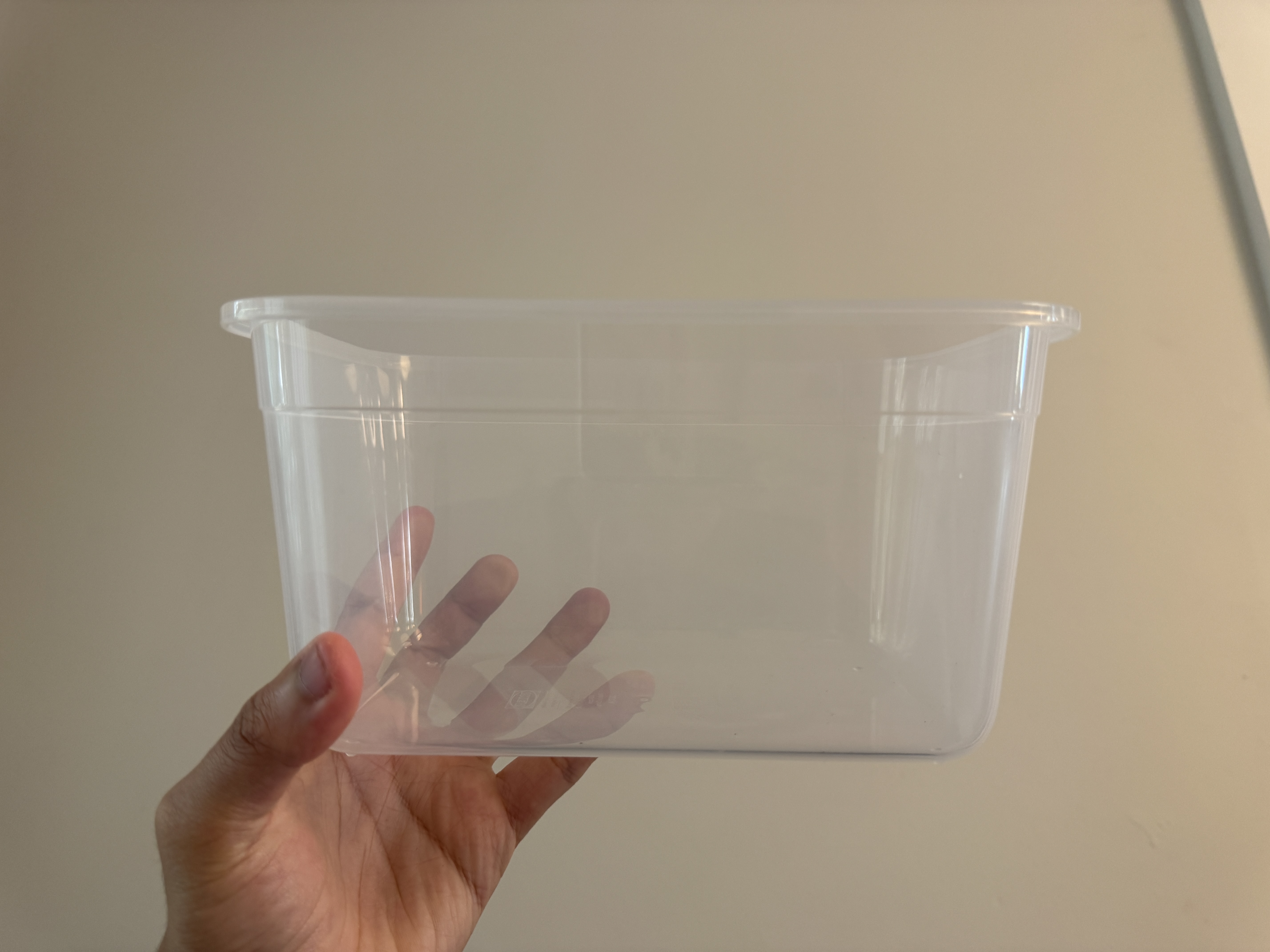
My initial idea was to use physical weight to represent workload, with individual transparent zip-top bags representing different activities, such as Family, Homework, Friends, Housework, Meetings, and Games. I also used a transparent plastic container labeled "CALENDAR" to hold all the bags.

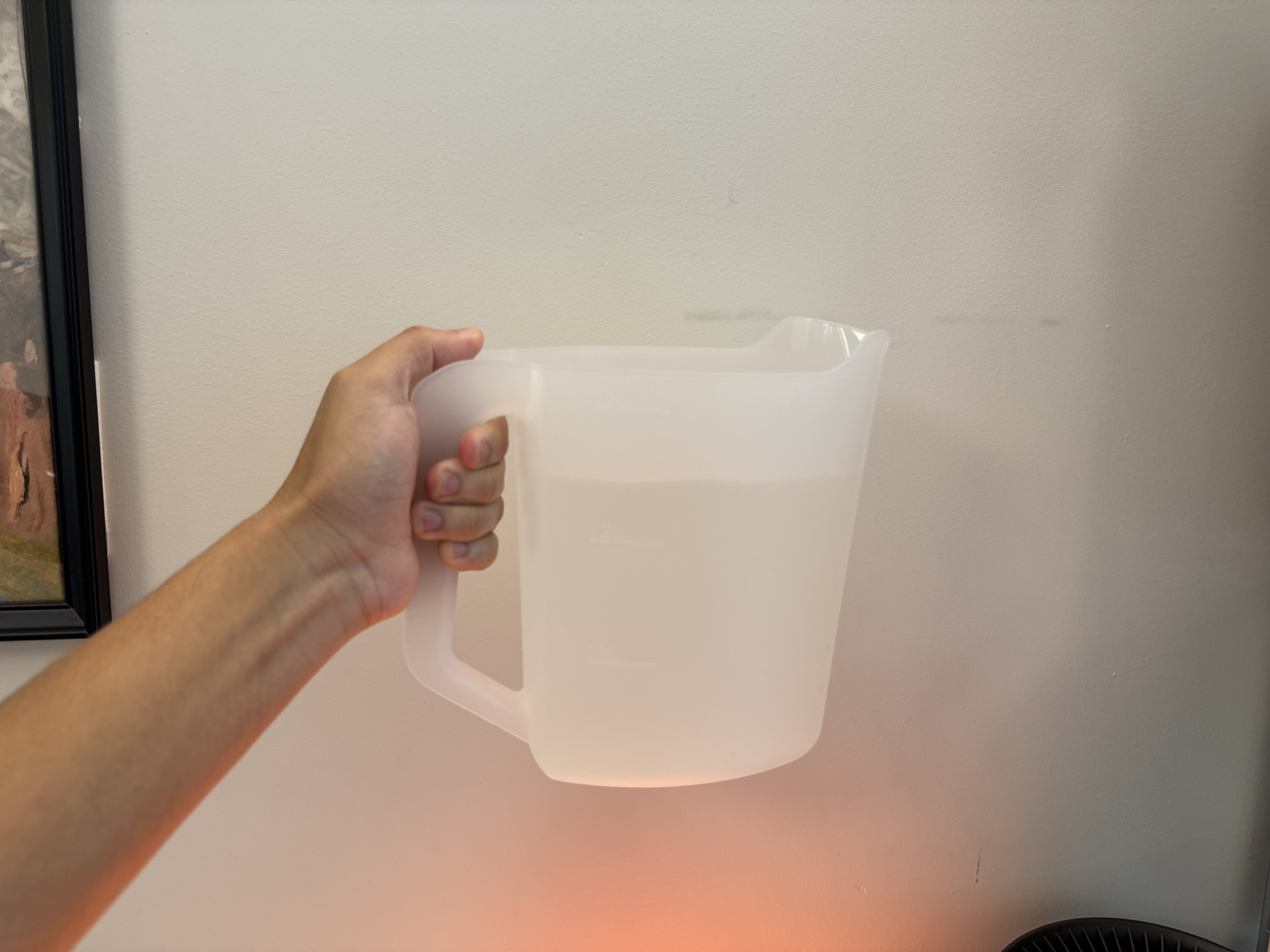
I first considered using rice to fill the bags, but I didn't want to waste food. I also thought about using sand before eventually deciding on water, which users could pour from a pitcher and adjust based on their own decisions.

Water can be reused, and I also liked its transparency. The water is almost invisible, but its weight is still there, which reminded me of how we don't always notice the effort behind our schedules.

Interaction Flow

  1. 01 Setup
  2. 02 Allocate
  3. 03 Arrange
  4. 04 Lift
  5. 05 Feel
  6. 06 Reflect

01/Setup

The interaction starts with a transparent box labeled "CALENDAR," several colorful zip-top bags representing different activities, and a pitcher of water.

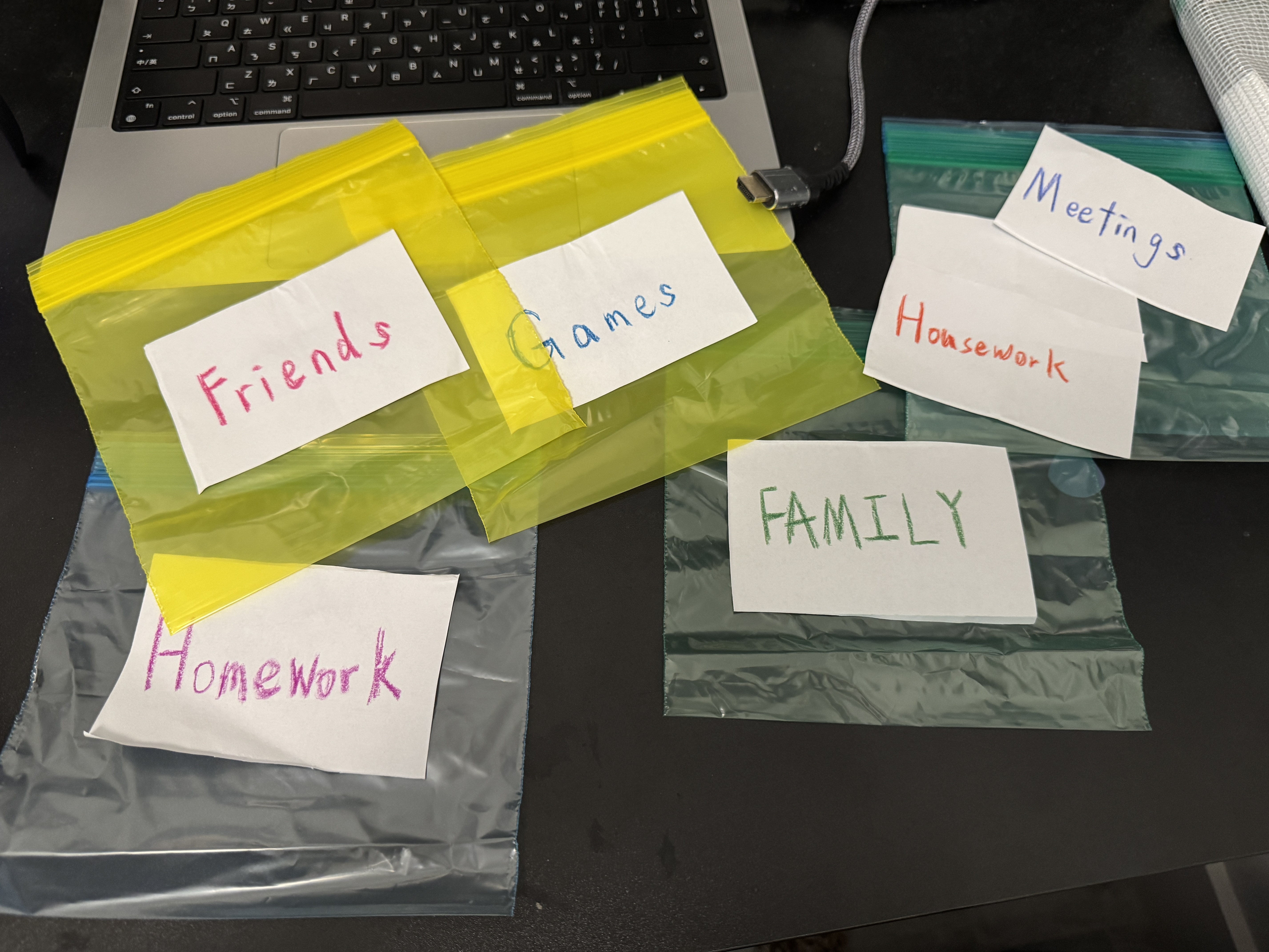
Each bag has a label, such as Homework, Friends, Family, Housework, Meetings, or Games. I wanted the setup to feel simple and familiar, without immediately revealing what the entire experience is about.

Empty colorful zip-top bags labeled Homework, Friends, Games, Family, Housework, and Meetings arranged beside a laptop.
The labeled task bags before participants allocate water.

02/Allocate

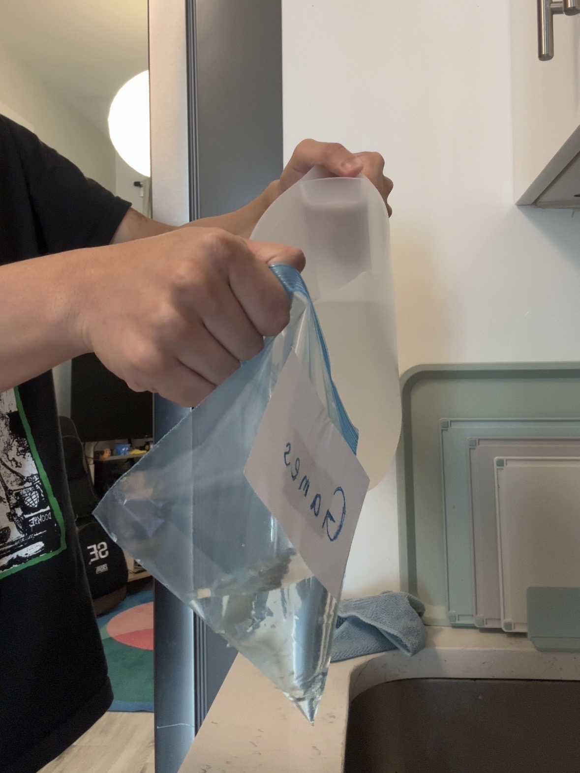
At the beginning, I don't explain the full meaning behind the materials. I simply ask users to choose activities and pour water into each bag based on how much work or energy they think each one requires.

There is no correct amount of water. What feels exhausting to one person might be relatively easy for someone else. I wanted users to make these decisions themselves, rather than having the interface tell them how much each activity should weigh.

I also wanted to make adding a task a more deliberate action. Unlike clicking an empty time slot in Google Calendar, users have to physically pour something into a bag and consider how much they are committing to it.

A person pours water from a translucent pitcher into a zip-top bag labeled Games.
Water is allocated according to the energy associated with an activity.

03/Arrange

After filling the bags, users are asked to place them into the Calendar Box in whatever order they prefer.

This is where the limitations of the container start to become noticeable. As more bags are added, there might not be enough room for everything. Users can squeeze the bags, rearrange them, take some out and try again, or even decide to pour out some water.

I found this part especially interesting because it feels similar to how we arrange our schedules. We can move events around or squeeze more activities into a day, but that doesn't necessarily make the workload any lighter.

Arranging activities within the limited space of the Calendar Box.

04/Lift

Once users finish arranging everything, I ask them to lift the entire Calendar Box using only one hand.

I chose this interaction because adding events to a digital calendar is usually effortless. We can do it on our phones with just a few taps, sometimes using only one hand.

But when those same activities become physical weight, the experience changes. Something that was easy to arrange suddenly becomes much harder to carry.

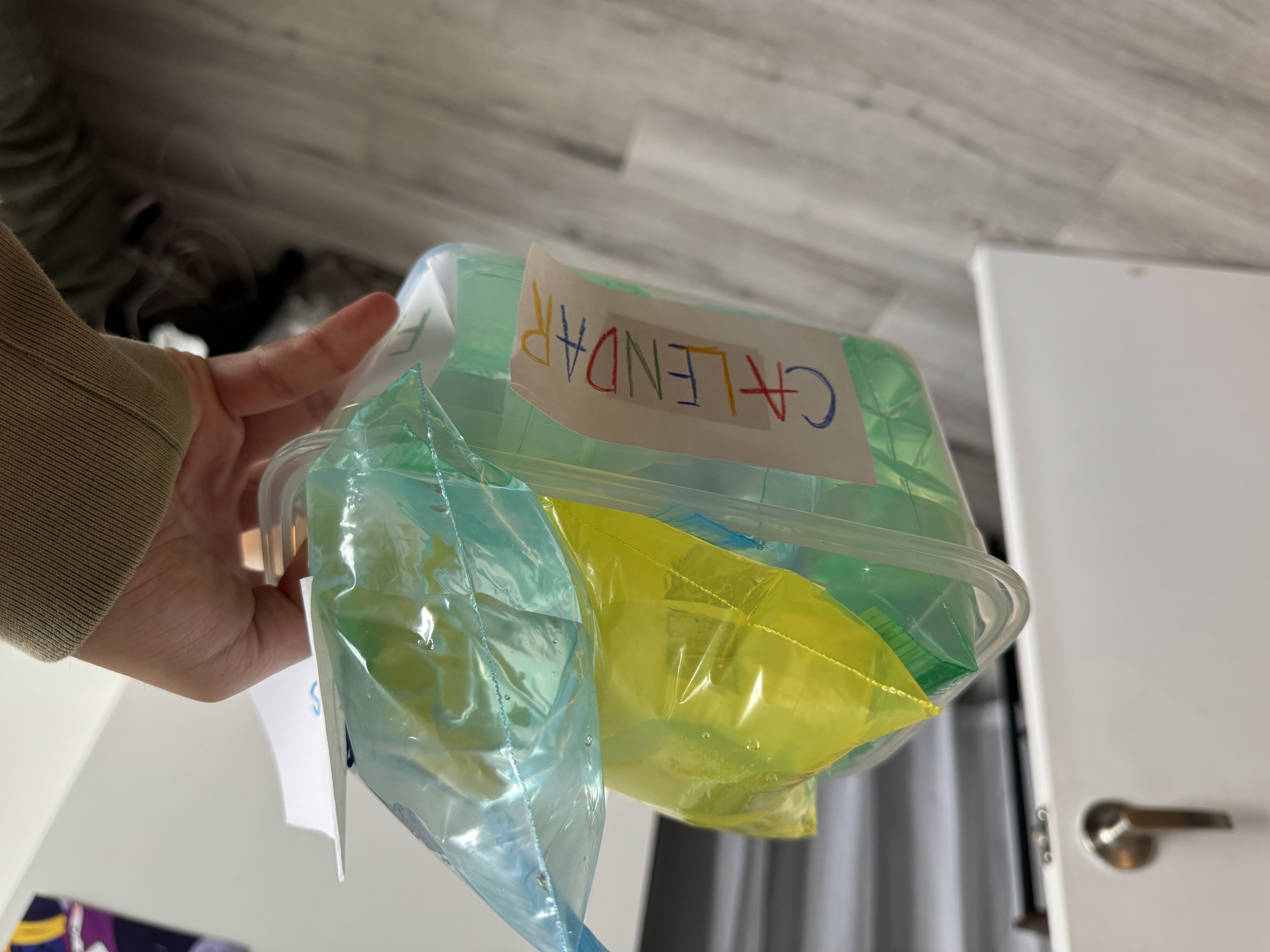
A hand lifting a transparent container labeled CALENDAR, filled with blue, green, and yellow water bags.
The completed Calendar Box, filled with the accumulated weight of different activities.

05–06/Feel & Reflect

This is the moment when users physically experience the result of their earlier decisions.

Even if they successfully fit all the bags into the box, they still have to deal with the accumulated weight. The space inside the container and the weight of its contents are two different limitations.

When I first tried lifting my own prototype, I was surprised by how heavy it felt. I had managed to fit everything inside, but that didn't mean it was easy to carry.

I intentionally leave the explanation until the end because I want users to experience the interaction before thinking about what it represents.

After lifting the box, I ask them to reflect on how they distributed the water, how they arranged the bags, and whether the final weight was what they expected.

The question I want to leave them with is:

Even if we can fit everything into our schedule, does that mean we have enough energy to handle it?

I don't want the prototype to tell people how they should plan their time. I want it to make them more aware of the decisions they already make when planning their everyday lives.
Concept diagram Two different constraints
Spatial Capacity
Can everything fit into the container?
Physical Capacity
Even if everything fits, can we comfortably lift it?

Experimentation & Findings

Filling the small bags with water was more difficult than I expected. Unlike adding an event to Google Calendar, it required some physical effort.

I also discovered that I could squeeze and rearrange the water-filled bags to fit more into the container. Even though they took up less space, their weight didn’t disappear.

When I finally lifted the completed container, it felt much heavier than I expected. This was the moment when the concept really started to make sense to me.

User Testing

I asked my roommate to try the prototype and noticed that we approached it quite differently.

He chose different amounts of water for the activities and placed the bags into the container in a different order.

He also found lifting the container with one hand difficult. He thought the experience was interesting and said it made him reflect on how he plans his own schedule.

This made me realize how subjective workload can be. The same activity might require very different amounts of energy for different people.

This physical prototype has no electronic or software connection to Google Calendar. It does not automatically sync with or modify a digital schedule.

06. Reflection

What I Learned

Before this project, I usually planned my schedule by checking whether I had enough time for another activity, without really considering how much energy I had left.

But after making and testing the prototype, I started thinking differently about my own planning habits.

One thing I found especially interesting was how differently people experienced the same interaction. Just like physical weight, workload can feel manageable to one person but overwhelming to another.

I think this is something a digital calendar can’t easily communicate. A number or time block doesn’t necessarily tell us how something will feel until we actually experience it.

Future Improvements

If I continued developing this project, I would improve the visual design and make the interaction more intuitive, especially the process of filling the small bags with water.

I would also like to experiment with other materials while keeping the physical experience of weight, which I think is the most important part of the project.

Back to the beginning ↑