Week 5: Website Accessibility Audit & Improvements
Weekly Goals
- Review the LTC website for accessibility issues.
- Understand how WCAG 2.2 applies to real websites.
- Identify issues involving images, headings, links, and interactive elements.
- Improve accessibility using Squarespace’s existing editing tools.
- Document findings and recommend further improvements.
Work & Progress
Reviewing the Level the Curve Website
Alongside my work on Lawrence’s Spinal Mobility Chair, I also worked on accessibility for the Level the Curve website. Since LTC develops assistive technology, I think it is especially important that people with different abilities can access the information about its products and projects.
I completed the initial audit on , using WCAG 2.2 Level A and AA as a reference. This Week 5 entry brings together that earlier review and the continuing Squarespace improvement work. The screenshots document editing and verification, but do not establish the exact date of each change.
The review identified unclear image alternatives, inconsistent headings, and repeated link labels. It also raised questions about forms and interactive feedback that needed hands-on testing. Thinking about how someone might navigate with a screen reader helped me look beyond the visual appearance of the pages.
Improving Image Alternative Text
One of the clearest issues was missing or unhelpful image descriptions. Some project images were described simply as “Image,” while product images sometimes used filenames. Those labels say very little about the appearance or function of an assistive device.
I worked on describing meaningful visual information through Squarespace’s image settings. For example, the audit recommended describing the Vesta Eating Tool as a gray tool attached to a metal spoon and shown from the side, rather than leaving its filename as the alternative text. This was a suggested description, not a verified published change.
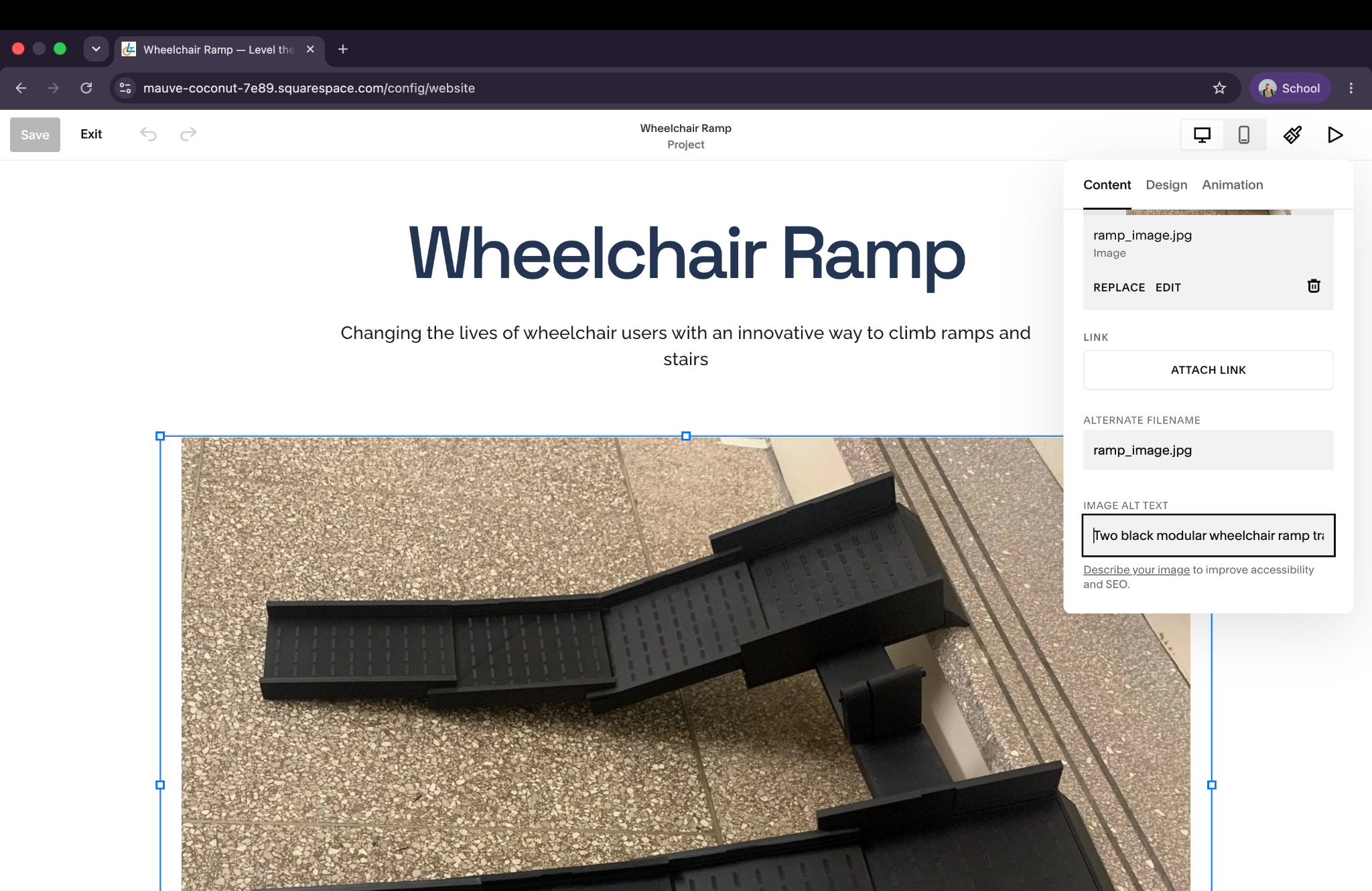
The existing screenshot documents work in the Wheelchair Ramp image’s alt-text field. Because only part of the entered description is visible, I cannot use it to confirm the full wording or claim that all product images were updated. It still helped me understand where these content changes could be made without rebuilding the site.
Reviewing Heading Structure
The audit also found headings that reflected visual styling rather than the structure of the document. I explored how heading levels help screen reader users move between sections and how to change those levels in Squarespace.
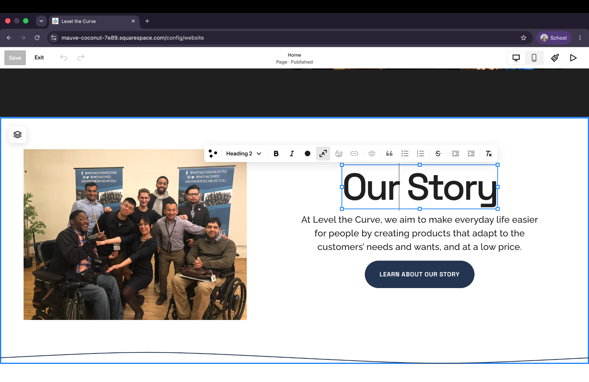
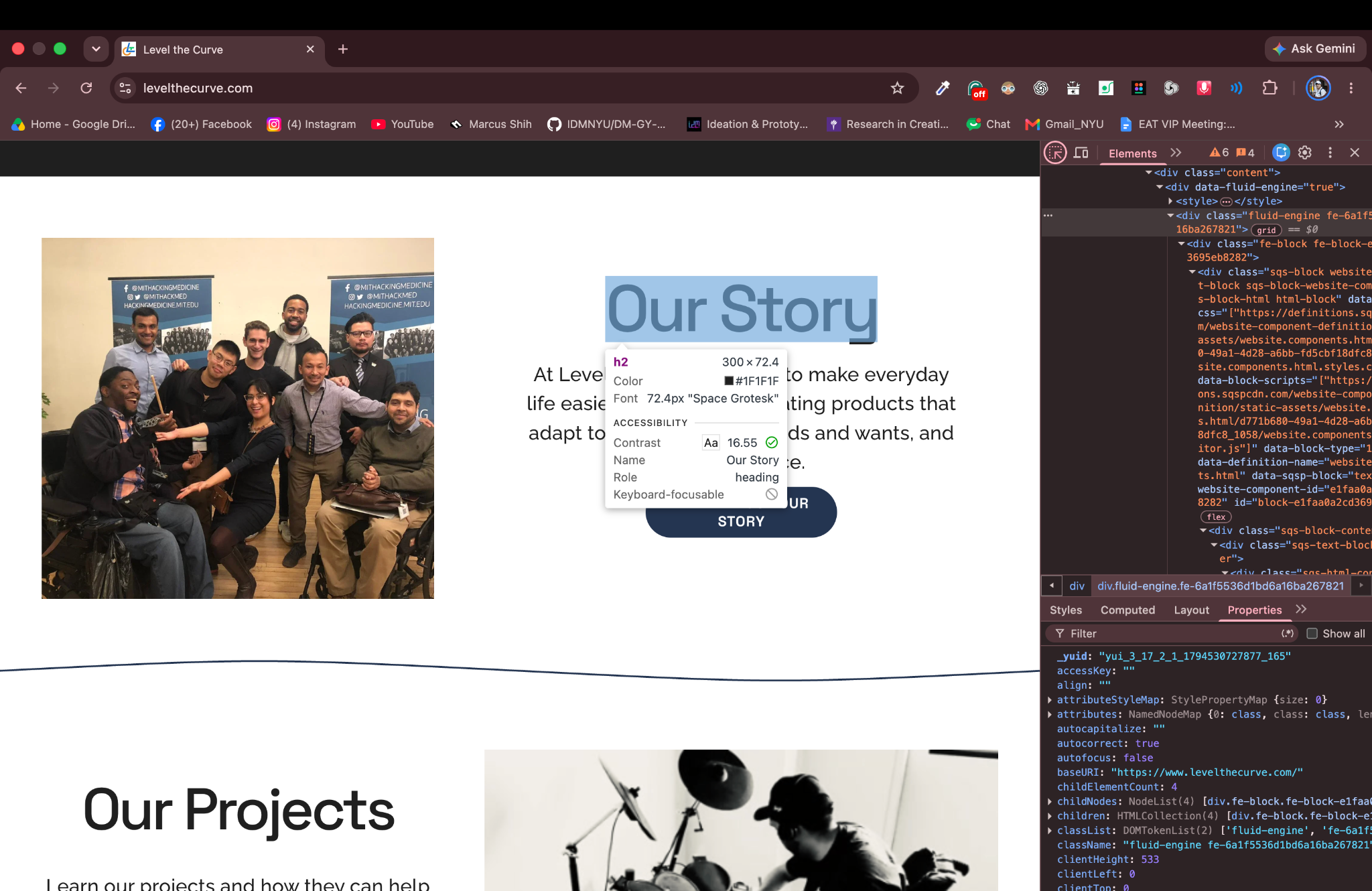
I updated “Our Story” to Heading 2 in the editor, then checked the live page in Chrome DevTools. The screenshot identifies it as an h2 element with the role of heading. This verifies that specific change; it does not show that the entire site’s heading hierarchy has been corrected.
I learned that the heading format and its visual styling can feel closely connected in a CMS. I needed to think about the semantic level separately from the size I wanted the text to appear.
Examining heading hierarchy and semantic structure within the Squarespace editor. The screenshots show the editing step and live-page verification.
Documenting Other Accessibility Issues
I organized the findings into priorities and recommendations for the LTC team. Some content changes could be made in Squarespace, while platform-generated interactions needed more investigation.
- Forms: review labels, instructions, errors, and keyboard behavior in embedded third-party forms.
- Navigation: test keyboard access, focus visibility, and focus order.
- Commerce: verify whether screen readers announce cart updates and whether product controls have useful accessible names.
- Readability: measure color contrast and check text resizing and reflow.
- Content: clarify link destinations and provide useful product information.
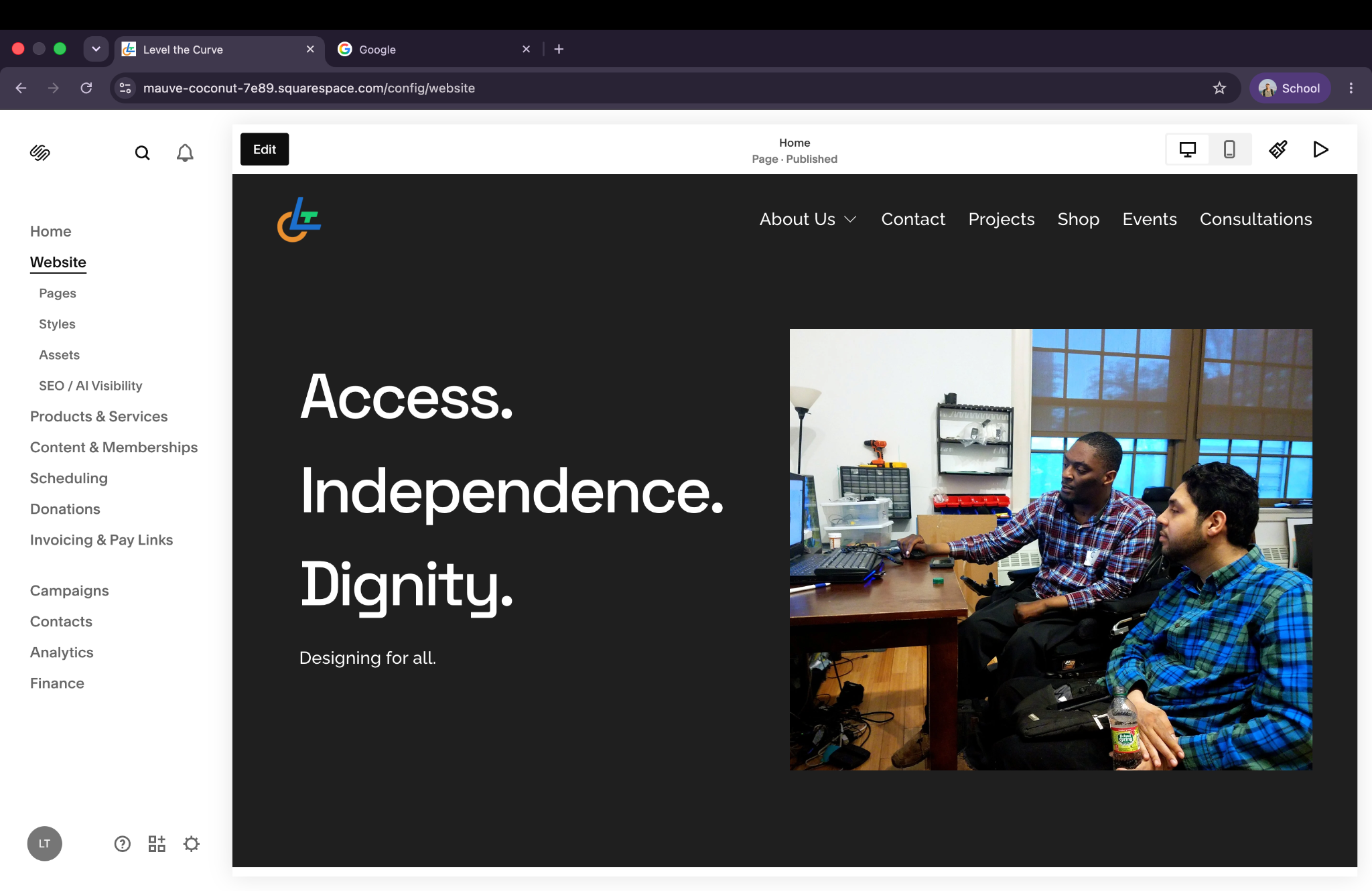
The project records also show the repeated “Learn more” labels changed to “Learn about our story” and “Explore our projects.” These destination-specific labels are easier to distinguish. The screenshot documents the updated wording, rather than a before-and-after comparison.
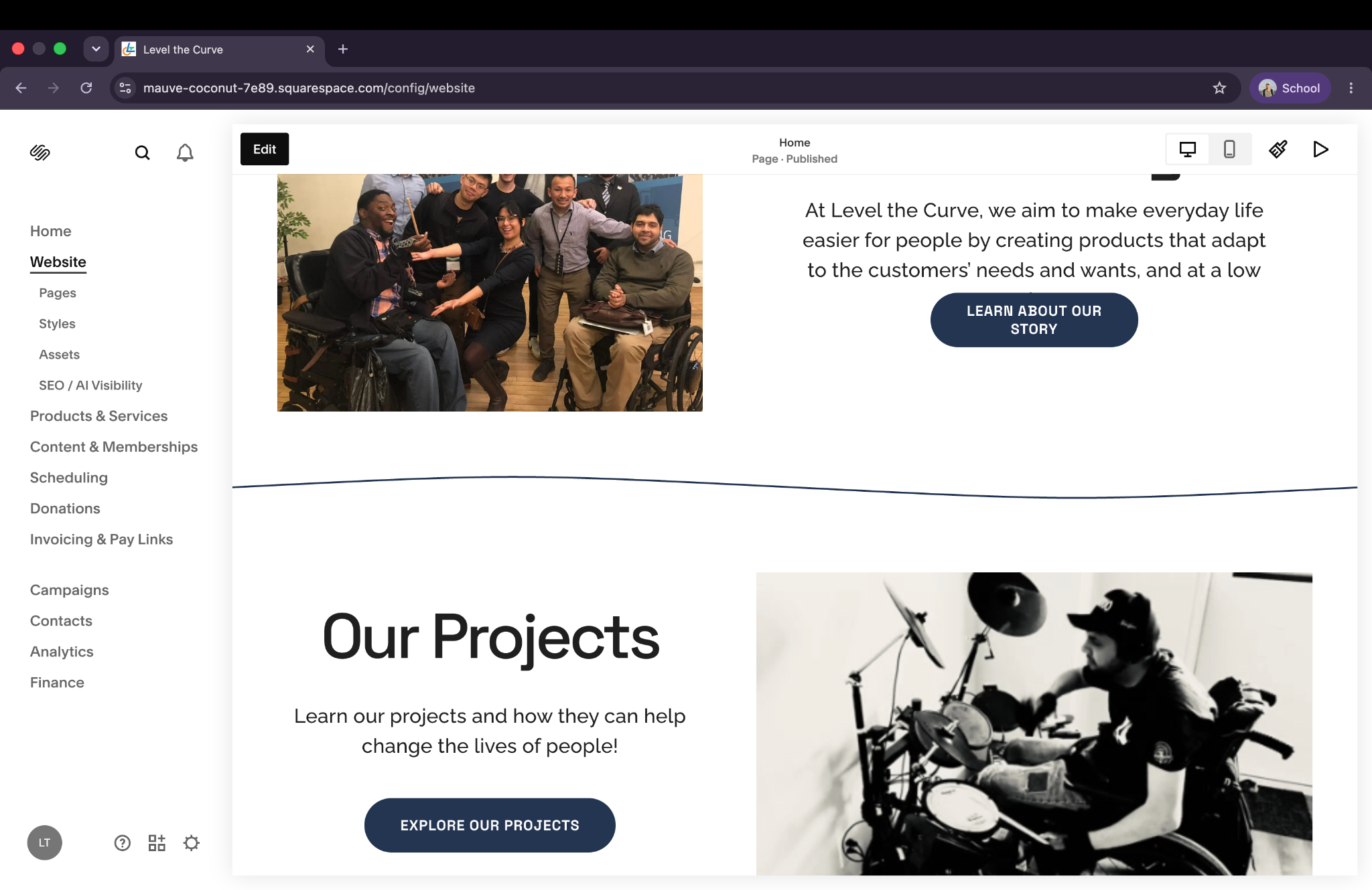
Keyboard navigation, screen reader feedback, and site-wide contrast testing remain open verification tasks. The contrast reading visible in the heading inspection applies only to that selected heading. I am not treating these records as evidence of full WCAG compliance.
Accessibility Audit Report
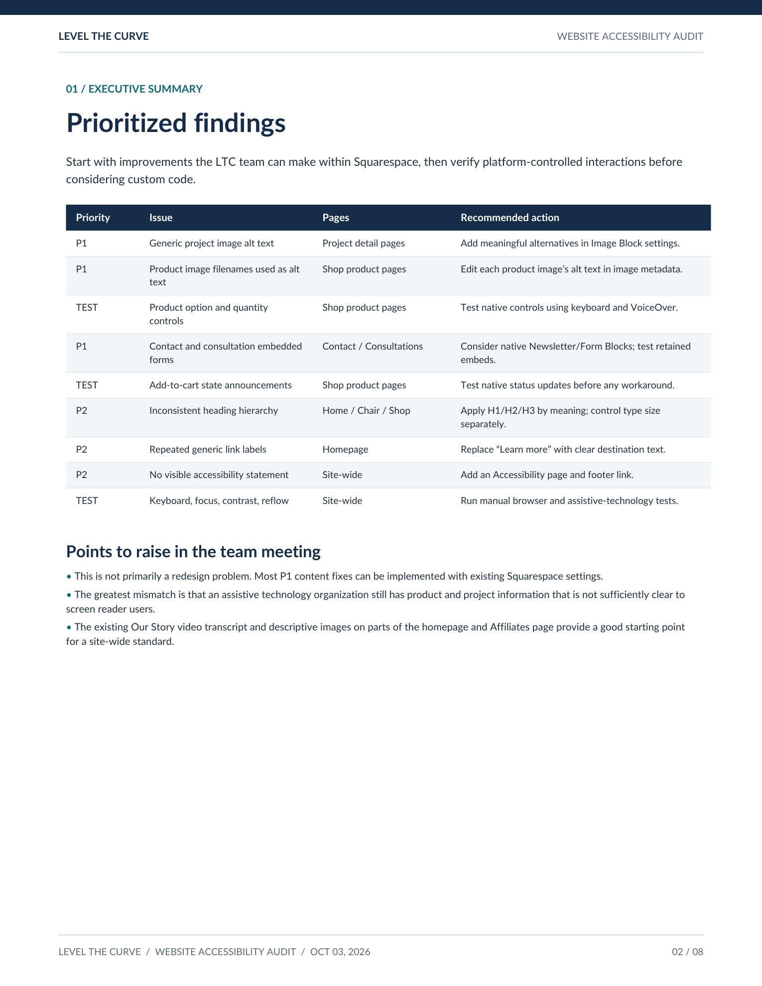
I documented the accessibility findings and recommendations in a report for the Level the Curve team, including prioritized issues, related WCAG guidelines, and suggested improvements.
The original audit is dated October 3, 2026. The English edition translates that audit and preserves its findings and testing tasks; it does not retroactively include later implementation changes. The existing preview below shows page 2 of the eight-page report.
Challenges / Questions
One of the biggest challenges was working within Squarespace rather than writing the website directly in HTML and CSS. Even when I understood the desired change, I did not always have control over the underlying structure or platform behavior.
I also realized that identifying a possible barrier is different from confirming a WCAG failure. A page crawl cannot tell me whether a cart update is announced at the right moment. That needs testing with the actual interaction and assistive technology.
- How can we improve semantic structure while preserving the original visual design?
- Which accessibility problems can be fixed directly in Squarespace?
- How can we verify that changes improve the screen reader experience?
- How should we prioritize improvements when time and platform control are limited?
Next Steps
Reflection
This work helped me realize that accessibility extends to the digital platforms used to introduce and distribute assistive technology. Clear product information and usable navigation matter alongside the design of the physical devices.
I was surprised by how much could be improved through content and structure without significantly changing the visual design. Writing useful alternative text made me think more carefully about what each image communicates, and changing a heading made the difference between visual styling and document structure more concrete.
At the same time, I learned that accessibility requires evaluation, implementation, and testing over time. Completing an edit is only one step; I still need to check what people experience when they use the site. That process connects closely to my interests in web development, user experience, and assistive technology.